posted by Terence Arjo @ 12/13/2005 01:53:00 PM
![]()
CommLab
CommBlog
Tuesday, December 13, 2005
Monday, December 12, 2005


Adaptive Technology - Accessible Design
The everyday object that I chose to redesign is the NYC MetroCard. In particular, the six ride $10 card, the one I buy and use. The main flaw of this card, and the card system as a whole, is that there is no way of knowing how much value a card holds. This is true with all the value cards available, as well as the unlimited ride cards. Unless you have a good memory and are adept at math, you can only guess at how many rides or days are left on your metrocard. Sure, you get reminded every time the card is swiped, but don't we have enough to keep track of in our lives? And if you're visually impaired? As they say in NYC: "fugghedaboutit!"
The only thing about the current metrocard that is adapted for the visually impaired is the slice taken out of the lower right corner. This helps orient the card for correct swiping. Other than that, there is nothing else to help a sight-challenged rider (or anyone else for that matter) know anything at all about the cards, other than an expiration date (which isn't relevant when it comes to monthly cards.)
This redesign solves the "how many rides problem" by both showing the original dollar amount of the card, and the number of trips the card provides. The number of rides are printed on the right side, and are notched out every time the card is used to enter the system. When you begin, you have 6 rides and no notches; when the card is dead, you have no rides and 6 notches. In addition, I have placed a notch at the bottom of the card to assist in differentiating between 6-ride, weekly and monthly cards. Each one can have a unique shaped notch (in my example, a half-round) or a unique combination of shapes (for example two half rounds, or a triangle.)
While I was at it, I decided to update the look of the cards. While my graphic design does not assist the visually-impaired, it does help celebrate a little bit of New York's transportation history and in the process refreshes the MTA brand.
posted by Terence Arjo @ 12/12/2005 06:01:00 PM
![]()
Wednesday, November 30, 2005
Crumpler
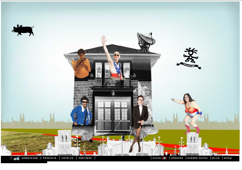
Crumpler is a manufacturer of messenger bags. The bags are produced in a wide variety of shapes, colors and styles. Their website expresses the fun-loving, freewheeling lifestyle that their bags embody.
I love how over-the-top the site is. Crumpler sets the mood straight away in one of the best intros I’ve seen in a while: it features a collage of an Uzi-waving girl riding a pig, with some clunky flash animation (probably intentional or it could also be my laptop.) A great little 60’s surf/monster movie soundtrack also helps to set a festive mood on the main page. The collage style is repeated throughout the site to great humorous effect. Navigational elements are animated and use rollovers to add additional animation. Each one has a unique little surprise in store: roll-overs also trigger a sampled sound clip with goofy things like “Oh honey, lay off.” Backgrounds for the site contrast with the crude collage style by employing the slick graphic look—now ubiquitous—of color gradations and silhouettes. This, however, works to make the collage animations even more bizarre and ridiculous.
I think I’m drawn to this animation by the punk rock humor, style and sillyness of it. They nailed the attitude that one would associate with bike messengers, hippies, punks and fun pigs —the folks who would totally buy these bags! I also like this site because it’s the complete opposite of what I would normally consider to be my aesthetic.
posted by Terence Arjo @ 11/30/2005 03:29:00 PM
![]()
Tuesday, November 01, 2005
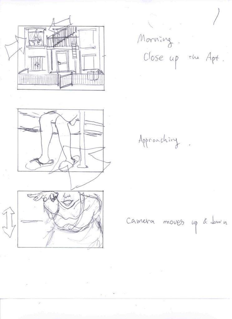
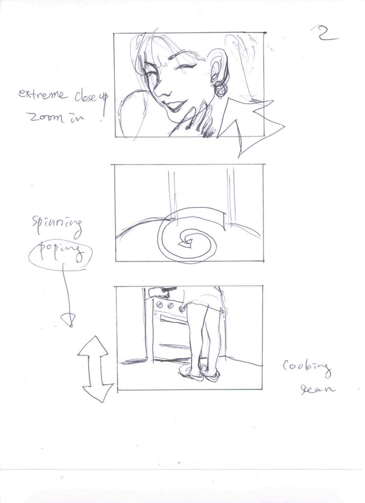
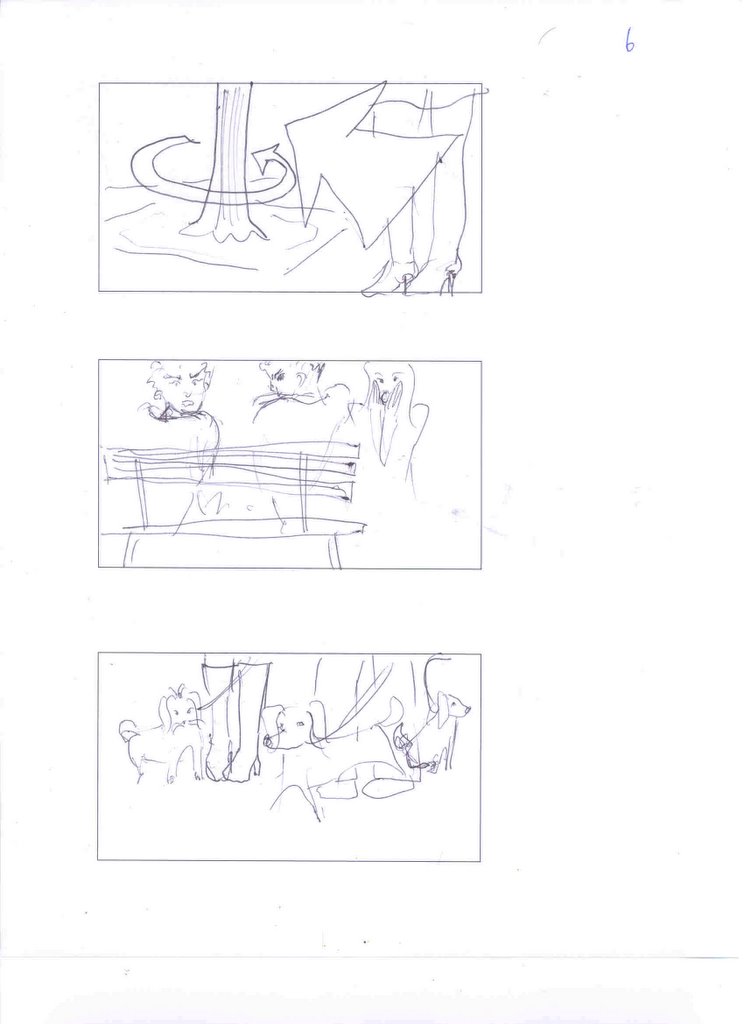
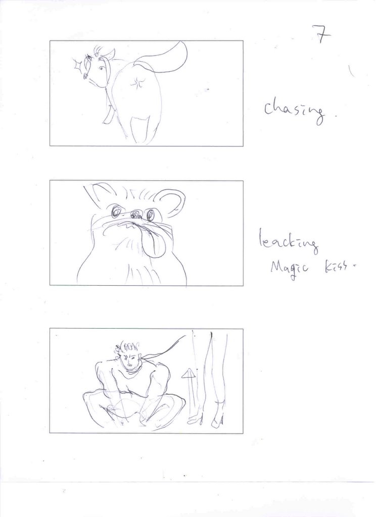
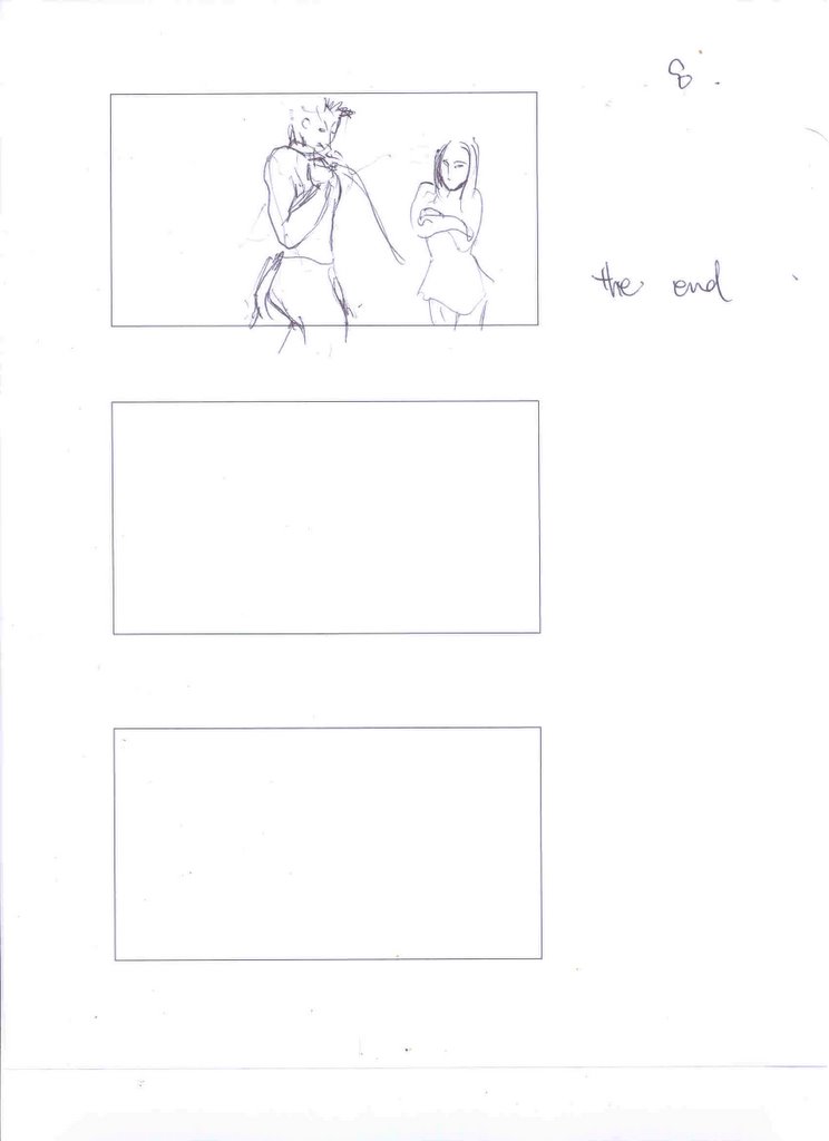
Video Project
We will be retelling the story of prince charming with a twist. It is shot from the point of view of our Prince, who has had a spell placed over him by the beautiful but evil princess. The story fallows the prince in his quest to break the spell.
Shot list:
Street shot of east village apartment
Interior of east village apartment kitchen
Interior of east village apartment building stairwell
Street shot, lots of pedestrians
Street shot, exterior of shoe store (east or west village TBD)
Street shot, sidewalk with tree (location TBD)
Street shot, dog park (location TBD)
Story Boards:


posted by Terence Arjo @ 11/01/2005 03:29:00 PM
![]()
Wednesday, October 26, 2005
Wednesday, October 12, 2005
The Audio Project
Carolina Pino and Terence Arjo
CONCEPT
“When I was a kid, I remember that some words, if not all of them, had meanings to me that were quite different from what they actually meant. For example, “viernes” (Friday in Spanish) meant a rainbow spreading through a cloud, rendered in some very pop colors. Or the word “flower” for me was an expanse of red fabric. These associations really helped me to understand, later on, what the real meaning of these words were.
A word, after all, is just the representation of a concept, often times an abstract one. This idea of free association, matching an image to a word, caught our attention. Could it be applied with sound as well? Might this lead to a better understanding of a complex concept? Could be interesting….
We would like to create a sound essay that examines the relationship between a concepts representation as words, and its representation as a sound. We propose presenting some of our fellow students a series words, and asking them to create the sound (and expressing it audibly) that would represent these concepts.
PROCESS
We will re-compose the responses, interweaving them with additional sound effects and samples with the Audacity Software.
1 track or channel for each word or concept.
SOURCES
-Sound captured during interviews with 5 different ITP students
Words and concepts to be used:
-Number 9 – Color BLUE – Word INTERACTION – Word MUSIC – Word
EQUIPMENT
-Marantz professional Recorder pmd660
-Microphone - Dynamic SM57
-Audacity Software
posted by Terence Arjo @ 10/12/2005 04:47:00 PM
![]()
Wednesday, September 28, 2005
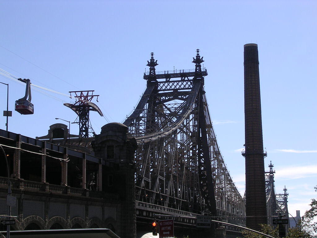
Rolf and I partnered up to check out the technology as well as the floating island. Due to the fact that I had to make a presentation to the Applications class this week, I let Rolf pick the technology. He suggested the Roosevelt Island tramway, which I thought was a great idea. I had never taken the tram nor gone to Roosevelt Island for that matter. Not only was it in keeping with the island theme, the tram positioned us perfectly to see the Robert Smithson piece.
I met Rolf at the Manhattan base of the tram early Saturday morning. We took a few photos from street level. Rolf experimented with his camera (which he’d checked out from the ER.) I had my own: a trusty Nikon Coolpix 3100. Rolf had a little difficulty figuring out the features on his camera, but this was most likely caused by his unfamiliarity with the apparatus. I keep my camera on the auto settings for most cases and usually get fine results.
To access the tram, we crossed a small plaza to the station. After climbing a flight of steps, we reached a platform. There was a window at the top of the staircase showcasing the mechanism that propels the tram above and across the river. We could see not only the giant cast iron wheels and the steel cable, but also the various other subsystems that help guide the cable around the wheels.
The tram is operated as part of the metro system, so a metro pass is needed to board. As I made my way through the turnstyle my card was rejected due to lack of funds. This is something that has always bothered me abought this metro system. There is no way of looking at a metro pass card to decipher the value remaining on it. When a rider purchases a $10 metro card, the pass allows entry into the system six times. It is up to the rider to mentally deduct the times the pass was used in order to anticipate the need to purchase a new one. If the rider loses track, he or she is faced with two options: the first and seemingly most popular, is to go for broke and try the ticket as one attempts to enter the subway system. This is a dangerous proposition in a busy station, particularly when there is a line of angry commuters piling up instantly behind anyone unlucky enough to have lost this gamble. The second option is to search out a card reader in some remote and random location in the station, say a quick prayer to the gods of transportation that the card reader might actually be functioning, then slide the pass through to see if it has any value.
Another little bit of technology that annoyed me was my experience with my camera’s batteries. They died on me when I was attempting the greatest shot of all time. Of course, I’d had ample warning, both through the camera’s graphical interface as well as through its behavior. It was also irritating dealing with flickr.com, yahoo.com and all the new passwords I had to develop (I think that I have about a dozen new ones since beginning ITP.)
But the metro pass thing really gets to me. There’s got to be a better way.
Photos can be found at:
http://www.flickr.com/photos/taitpcomlab/
posted by Terence Arjo @ 9/28/2005 01:00:00 PM
![]()
Links
Previous Posts
- Play the MoviePLAYFinal Flash animation. Wow, were...
- Adaptive Technology - Accessible DesignThe everyda...
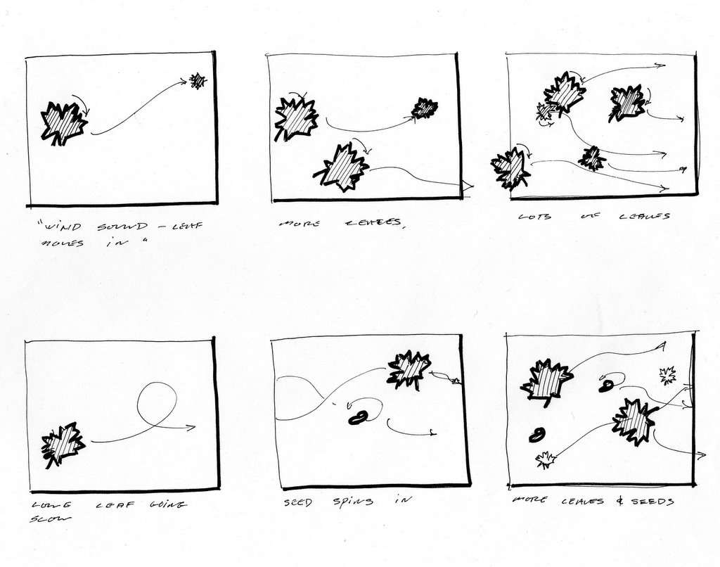
- Final Flash Animation Story Board
- CrumplerCrumpler is a manufacturer of messenger ba...
- Video ProjectWe will be retelling the story of pri...
- Audio postthe plan file
- The Audio ProjectCarolina Pino and Terence ArjoCON...
- Rolf and I partnered up to check out the technolog...
- This has become a rather frustrating exercise. The...
Archives
